
Ever bought something for your house because you absolutely loved it in the store, only to bring it home and realize it didn’t quite work with anything else?
Yeah. Decorating can be like that.
The good news is that creating a cohesive home doesn’t mean everything has to match, and you definitely don’t have to limit yourself to beige walls and identical furniture.
A good color palette gives your space some direction while still leaving plenty of room for personality.
Here’s how to put one together.

1. Start With the Feeling You Want
Before picking paint colors or buying throw pillows, think about how you want your space to feel.
Do you want something bright and airy? Cozy and relaxing? Dramatic and moody? Colorful and eclectic?
You can love several different design styles, but choosing a general mood makes decisions much easier.
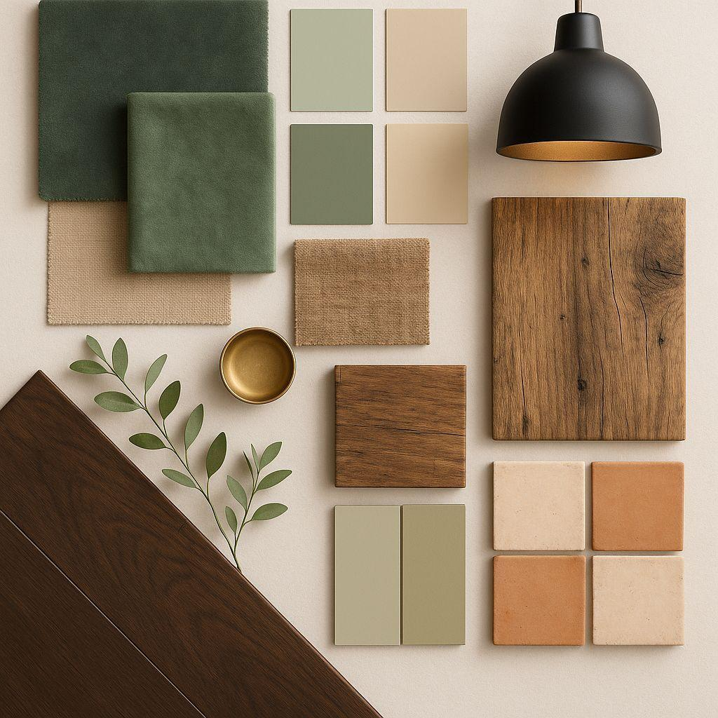
Personally, I’m drawn to warm, moody interiors with natural textures, dark greens, wood tones, and a little vintage personality.
That doesn’t mean every room needs to look identical. It just gives me a starting point.
2. Work With What You Already Own
You don’t have to start your color palette from scratch.
Look at the bigger things in your home that aren’t likely to change anytime soon.
Think about your flooring, kitchen cabinets, countertops, sofas, and large furniture.
These pieces already influence how colors look in your space.
For example, if you have warm wood floors and walnut furniture, you might choose colors that complement those undertones instead of fighting against them.
Building around what you already have can also save a considerable amount of money.
3. Choose Three Main Colors
You don’t need 15 different paint swatches to get started.
Try picking three primary colors:
A base color: Usually a neutral that works across larger surfaces, like warm white, ivory, beige, gray, or charcoal.
A grounding color: Something with a little more personality, such as forest green, navy, terracotta, or chocolate brown.
An accent color: A complementary shade that adds warmth, contrast, or interest.
Once you have those, you can introduce a few additional shades through accessories and decorative details.
The goal isn’t to restrict your creativity. It’s to give your choices a little structure.

4. Pay Attention to Undertones
Two colors can look beautiful separately and feel completely wrong together.
Sometimes the problem isn’t the actual color. It’s the undertone.
For example, one beige might lean yellow and warm, while another leans gray and cool.
Neither is necessarily better, but the difference becomes noticeable when they’re placed next to each other.
Lighting matters, too.
A paint color that looks perfect in a bright, naturally lit room might feel very different in a darker room with warm artificial lighting.
Whenever possible, test colors in the actual space before committing.
5. Try the 60-30-10 Rule
If you’re struggling to decide how much of each color to use, the 60-30-10 rule can be a helpful starting point.
The idea is to divide your room’s color scheme into roughly:
- 60% dominant color: Walls, large furniture, or other major surfaces.
- 30% secondary color: Upholstery, curtains, rugs, or additional furniture.
- 10% accent color: Pillows, artwork, pottery, and smaller accessories.
It’s a design guideline, not a law.
You can absolutely break it. But it can help if a room feels visually unbalanced and you’re not sure why.
6. Repeat Colors Throughout Your Space
One of the easiest ways to make a room feel cohesive is to repeat a few colors in different places.
If you have a dark green accent chair, consider incorporating a little of that same green in artwork, pillows, or another decorative element.
The pieces don’t have to be identical.
You can even use lighter and darker versions of the same color to create depth.
This is especially useful in open-concept spaces where multiple rooms are visible at once.
7. Use Texture to Keep Things Interesting
A coordinated color palette doesn’t have to be boring.
In fact, I think texture is one of the things that makes a room feel finished.
Imagine a room with ivory walls, a dark green sofa, and walnut furniture.
Now add a chunky knit throw, linen curtains, ceramic pottery, woven baskets, and a few plants.
The colors stay relatively consistent, but the different textures give the room personality.
Mixing materials can make a space feel much more layered and lived-in.
8. Make a Mood Board Before You Buy Anything
This might be my favorite part.
Before spending money on new decor, put together a simple mood board.
You can do this in Canva using photos of your existing furniture, paint swatches, inspiration images, fabric textures, and decorative pieces you’re considering.
Try arranging everything together on one page.
Do the colors complement one another? Does anything feel out of place? Are you missing contrast or texture?
It’s much easier to change your mind on a mood board than after you’ve purchased an expensive piece of furniture.
A Color Palette I’m Loving Right Now

If you love warm, earthy, slightly moody interiors, here’s a combination worth trying:
- Warm Ivory:
#F4F0E8 - Dark Pine:
#303F36 - Walnut:
#A27F5A - Oatmeal:
#D9D0C3 - Muted Mauve:
#B3A3B9
I love how the ivory keeps the palette light enough to breathe, while the pine green adds depth. Walnut brings in warmth, and the mauve offers a softer accent without making everything feel overly coordinated.
You could use this palette in a modern living room, a cozy bedroom, or even a creative home office.
And no, you don’t have to repaint your entire house to use it.
Your Home Doesn’t Have to Match Perfectly
At the end of the day, your home should feel like yours.
A cohesive color palette is just a tool to help you make decorating decisions with a little more confidence.
Mix the styles you love. Keep the sentimental pieces. Add the weird vintage lamp if it makes you happy.
A little coordination goes a long way, but personality is what makes a house feel like home.
Looking for inspiration? Explore my curated home decor and furniture finds through DreamyHomeVibe on LTK.
Some shopping links may be affiliate links, which means I may earn a commission from qualifying purchases at no additional cost to you.
A little bit of home. A little bit of everything.
© Copyright 2026. Jessica Head, REALTOR®, Keller Williams The Woodlands and Magnolia
Stay in touch with Jessica!
Never miss a new post!

